
Daphne’s Macarons | my macaron business
Brand Identity, Packaging, Logo Creation
Design Tools: Adobe Illustrator
Duration: June 2018-Present
ABOUT THIS PROJECT
Daphne's Macarons was created in February 2015 in order to combine my passion for baking and business into one. The goal of this business is to create a strong network of customers and to generate profit. Through baking, I can explore and experiment with different flavors and recipes while adding my own elements to the mix.
Final Logo Design
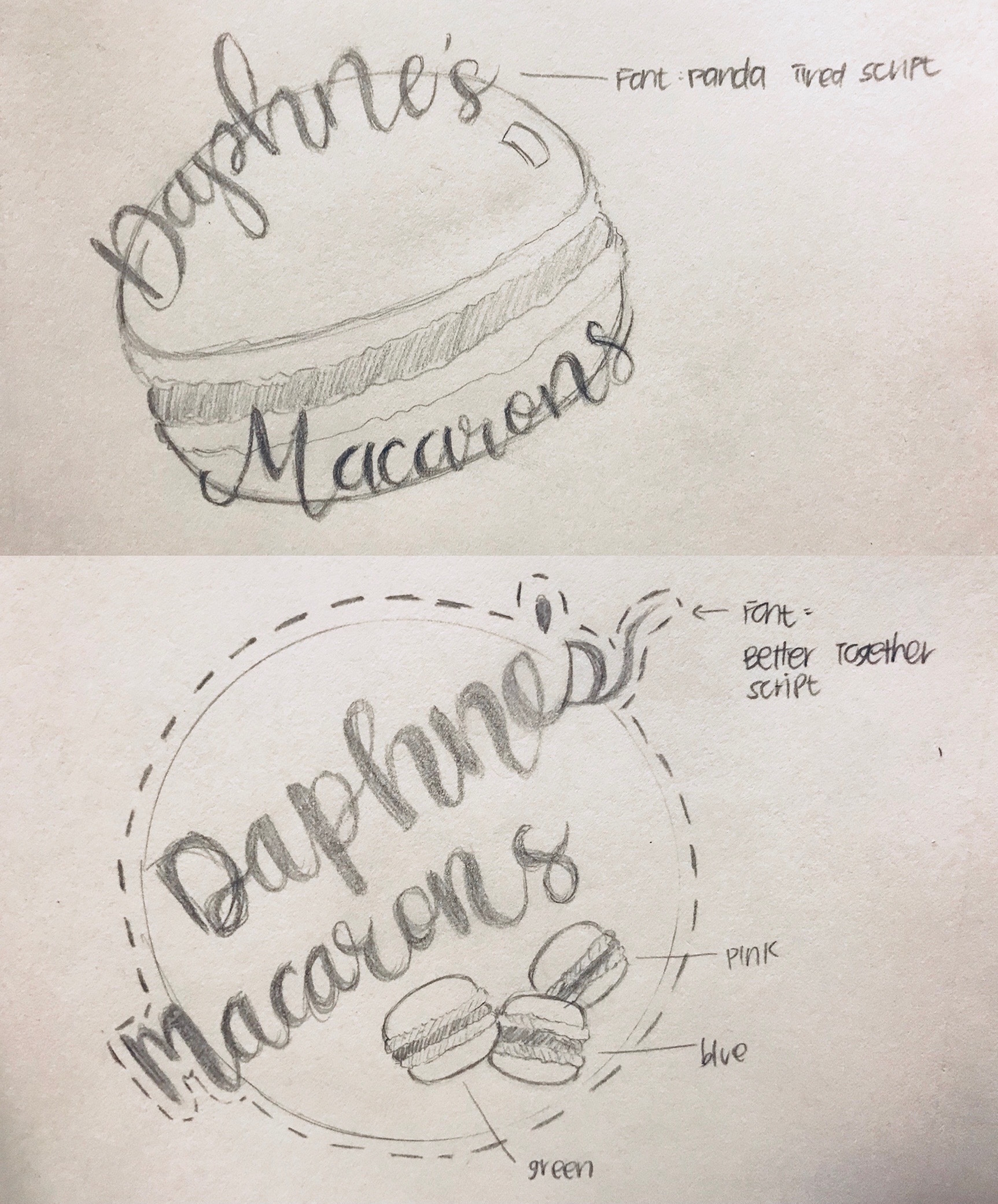
Sketches, Process and Procedure
In February 2018, I gained exposure to Adobe Creative Cloud, Illustrator and Photoshop in particular. I used Adobe Illustrator in order to create a logo and menu for Daphne's Macarons.
For the logo, I researched a lot of different bakery logos in order to solidify the idea I wanted of a simple yet professional logo. After a period of just researching different fonts and designs, I sketched out the two designs shown on the right. Initially, after posting my design sketches onto the web for feedback, the top design was more popular due to its cuteness; however, the bottom design seemed to gain more attention when it came to looking more professional and clean.
The logo ended up looking as shown above. Since the font "Better Together Script" did not have as smooth of lines as I initially imagined, I added a stroke size of 1 with a color similar to the background. The macarons were originally supposed to be pink, blue and green; however, I ended up wanting to base the colors off of more realistic macaron flavors. I made the macarons resemble pistachio, chocolate and raspberry flavored macarons.

Design 1

Design 2
Reflections
Through this project, I took my first step towards learning how to use Adobe Illustrator. I spent a lot of time researching different logo designs and I think that helped open my eyes to new and different styles by various companies.
I learned a lot in about the importance of the placement of every element. Each element can make a big difference and colors can also make huge differences. The original colors of my macarons were very neutral colors such as grey for the “Oreo” flavor and dandelion yellow for “Salted Caramel”, but after some thought and consideration, I didn’t think the colors were too appetizing and they didn’t have a good enough contrast against the tan background.
Overall, I am very satisfied with how the stickers turned out and was able to use the stickers on my macaron boxes whenever I had orders to fulfill.


