
Love
EXPLORING THE MEANING OF LOVE

ROLE: Illustrator DESIGN TOOLS: Adobe Illustrator DURATION: Feb 6 - Feb 18 (12 day project)
ABOUT THIS PROJECT
The main focus of this project was to create a series of posters representing different types of love. I’ve always been very interested in this topic and the idea of how love could be depicted in so many different ways. In this project, I chose 4 specific types of love to depict. They are by no means representative of every type of love out there. The four types of love I chose to represent are platonic, unrequited, romantic and familial.

RESEARCH
What is Love?
I started off by researching common types of love. Romantic and platonic love were the two that first came to mind. Since flowers often hold different meanings depending on their color and type, I thought about how I could potentially utilize flowers to depict these emotions. While researching yellow flowers to signify friendship, I stumbled upon the daffodil; however, I learned that the daffodil has two meanings, with another meaning “unrequited love.”
What does Love embody?
I spent a couple days brainstorming and sketching before finalizing my design concept. My ideas generally consisted of combinations of opinions people had and how they chose to describe their feelings.
01 Platonic Love | Yellow Rose
Close relationships
Non-sexual
No romantic intent
Both parties feel overwhelming gratitude, fondness and interest for one another
Emotionally/mentally connected
Comfortable / Easy
Powerful
No Pressure / No Obligation
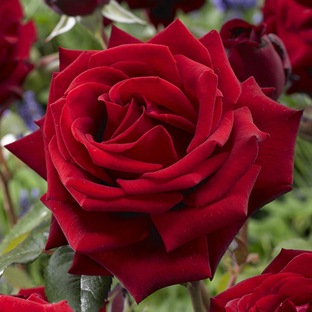
02 Romantic Love | Red Rose
Involuntary like thirst
Craving for a specific person
Natural addiction / Makes you lose control
Potential Sex Drive / Lust
When two people find each other and connect
A feeling that gives you all the emotions at once
Finding someone you can let into your life
A leap of faith
03 Unrequited Love | Daffodil
Loving someone who doesn’t love you back
Heartache
Someone who can make you happy yet sad at the same time
One-sided
Focusing on someone else’s needs rather than your own
A Crush
Painful
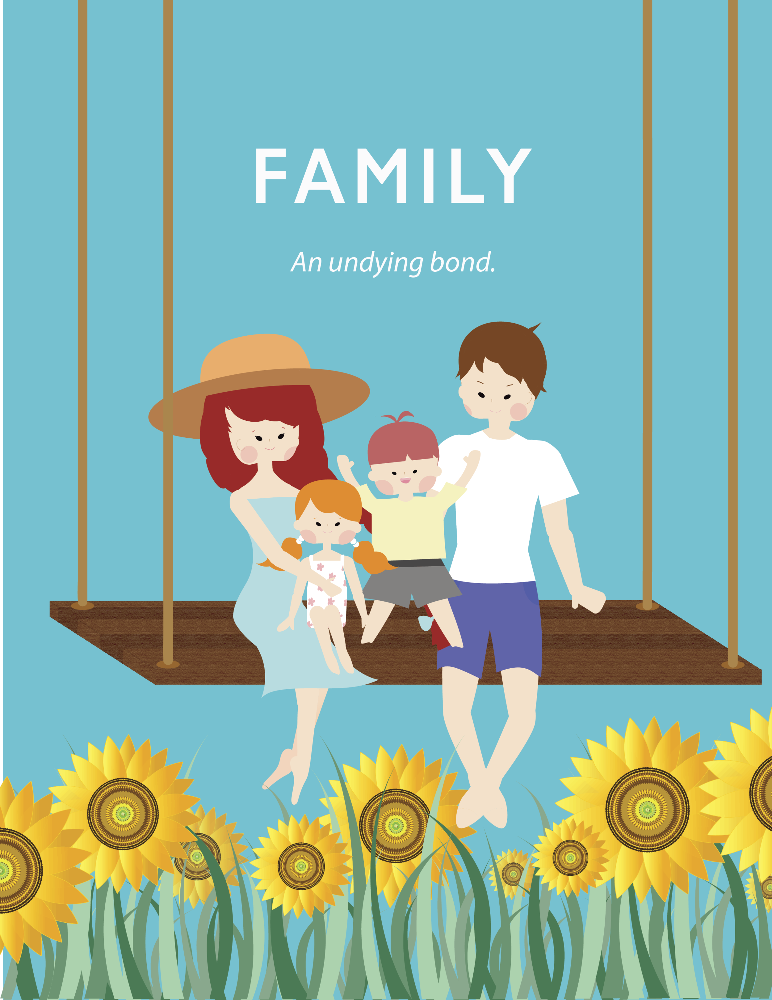
04 Familial Love | Sunflowers
Unconditional / Non-Judgmental love
Safe
Emotional / Mental Support
Shared beliefs, values, traditions
Constantly evolving
Can still be family with or without blood bonds
A place to call home
Constantly changing
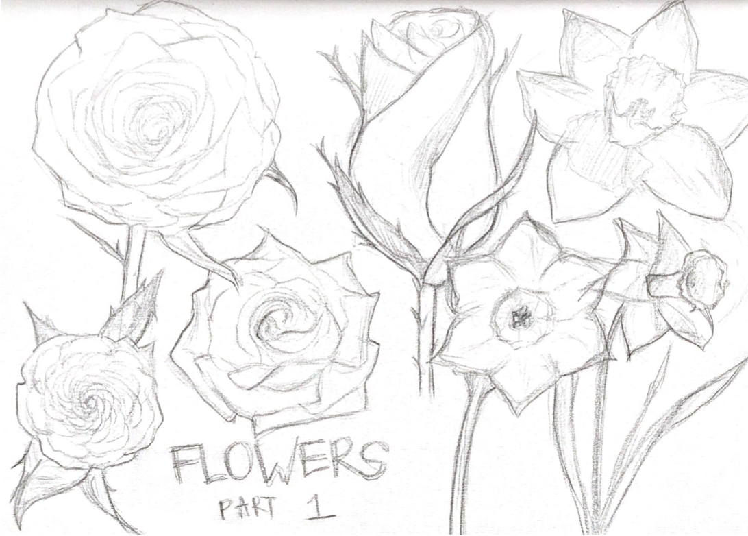
Flower Research for Platonic/Romantic Love
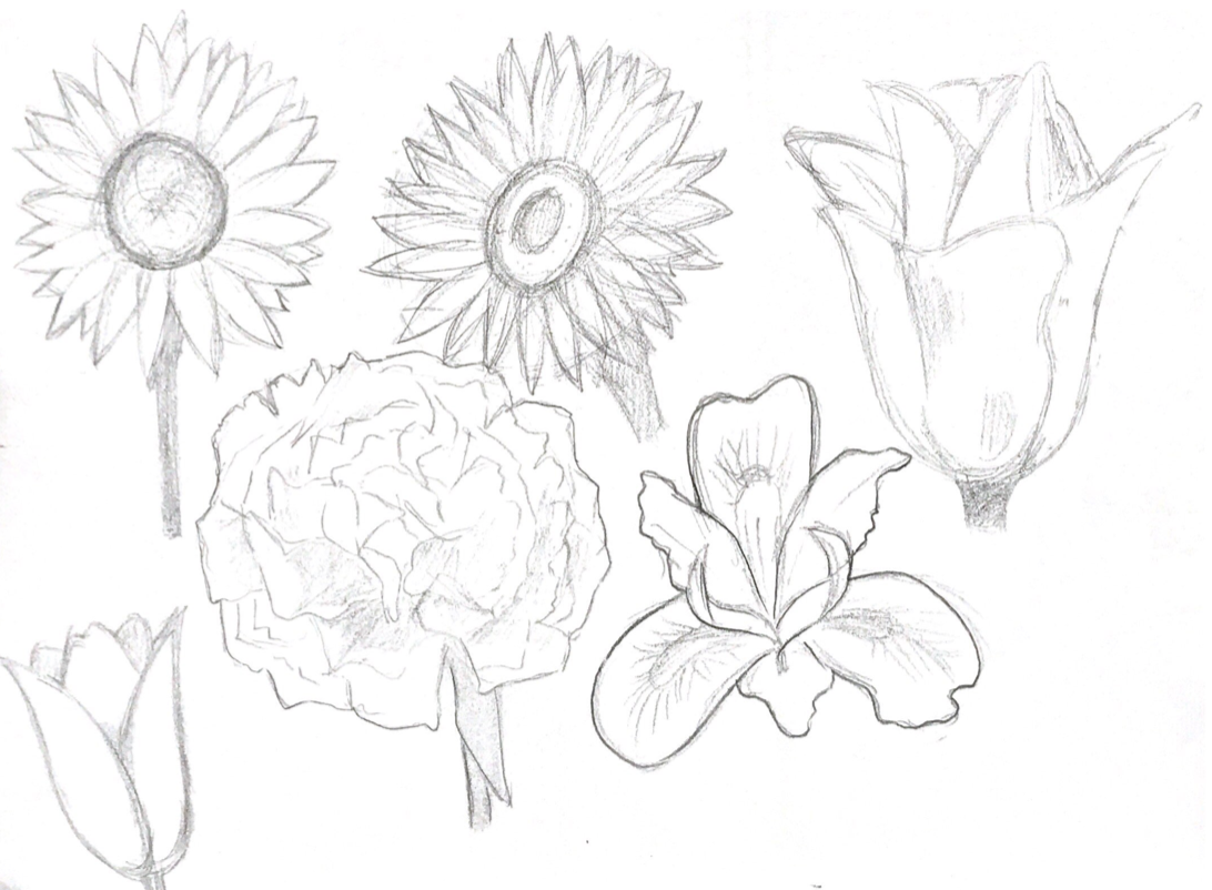
Flower Research for Family/Unrequited Love
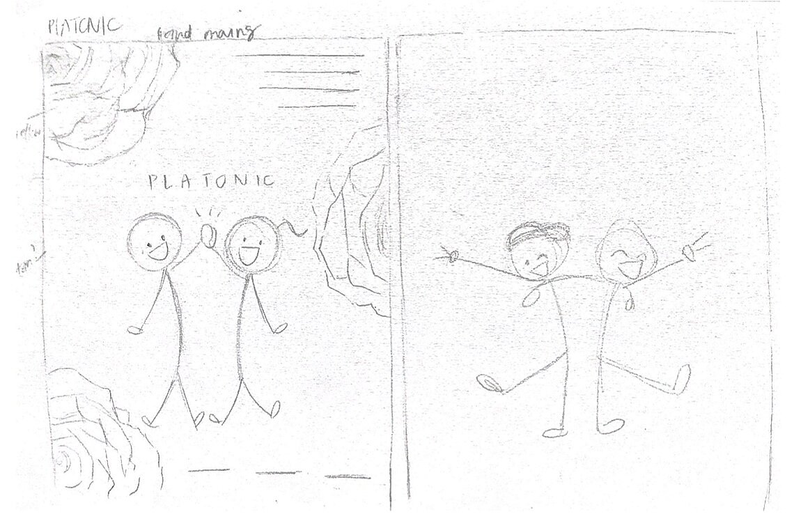
CONCEPT SKETCHES
I started off brainstorming potential poses per type of love. Some poses were based off of memory and observations, while others were based off of photos and inspirations I found online.
After sketching out potential poses, I moved on to poster formatting and layouts. I aimed to create at least two different poster sketches per concept. The most challenging part of this process was figuring out how to combine the layout with the message I wanted to convey.


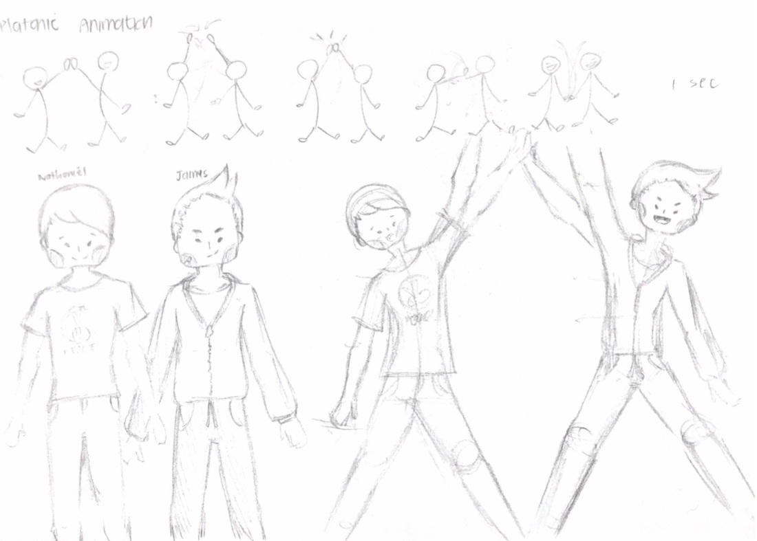
CHARACTER DESIGNS
After figuring out the potential poster designs, I moved onto character designs. Although stick figures are cute , I wanted to design actual characters for this project.
The first character, Ellie, was modeled after my friend Eileen, who is very kind and forgiving. Nathaniel is your typical popular nice guy in college and was modeled after my close friend Elliott. The two of them together represent romantic love. Ruby and James was the couple I created for the familial love poster, and Matt is the poor guy I created for the unrequited love posters.


VECTOR ILLUSTRATIONS
Since this was my first time challenging vector illustrations, I focused on keeping it simple and used combinations of shapes and small lines. Since this was my first attempt at vector illustrations, I was very happy at how they turned out in comparison to my sketches.

I started my vector illustrations by first constructing body parts. The body parts were creating from a series of trimming and connecting different shapes of various sizes. When sketching out the body shapes on my sketchbook, I was able to see more details, but when drawn with no stroke weight, it was hard for me to decipher where certain body parts such as the breasts were properly located.
I had two iterations of the girls’ bodies. The body on the top left is Ruby’s body. Since Ruby has a smaller chest, I focused on making her more curvy on her bottom half. The body next to Ruby is Ellie’s body. Ellie has a smaller frame, but she seems to have a bigger top half due to her breasts.
I only had one iteration of the boys’ bodies. Rather than focusing on an hourglass shape, I tried focusing on using a dorito shape as a base, making his lines slightly harsher and his neck slightly less petite looking. I stretched different body parts in order to match the heights of each male character.
01 Daffodils
I created three flowers for this project. For colors and specific shapes, I referred a lot to reference photos and my hand-drawn sketches as guides. Rather than making it super complicated, I used a gradient effect in order to mimic the changes in color from orange to yellow to slight brown, due to the shadows.

Single Daffodil

Reference
02 Roses
Drawing the rose was a bit of complicated in the fact that I do not have a drawing pen or tablet. The only tool I have to draw with is my mousepad. I think flowers are never perfect. Each flower, even if they are from the same family, can look different from one another depending on the amount of sunlight they get and so forth. I wanted to make the rose look slightly messy in the sense that it’s look more real, but it proved to be quite a challenge.
Reference

Roses Color and Stroke Color Iterations
03 Sunflowers
The sunflower was the last flower I worked on as the Family poster was the last one I worked on. The sunflower, unlike any other flower, has so many different parts to it. In my opinion, the center of the sunflower resembles the golden ratio and I was very fascinated by it. Although I couldn’t mimic the design of the sunflower, I tried to use multiple little shapes in order to mimic the color. I used over 1000 shapes in order to create the sunflower and although I think I could have still made it more intricate and exact, due to some time limitations, I went with this version.

Reference

Sunflower
DESIGN ITERATIONS
Hello, World!
When working on the “Romantic” poster, I felt like the top half of the poster was a bit too empty. Version 1 in the middle was my attempt to create a clean poster matching the “Platonic” poster, but I continued to experiment as I was not really sure I liked the idea of the large rose.
Version 2 on the left was my attempt to use more words to describe the emotion. I chose to incorporate a quote I thought best represented “Romantic” love and a series of words important in maintaining a relationship. The hearts were overflowing with “affection”. The text “Support” and “Trust” were placed under the bench to demonstrate two very important ideas crucial to a relationship. Lastly, the bench is made of the word “Communication". I believe that good communication is one the most important aspects to have in a relationship.
Version 3 on the right was meant to be a cleaner version of the first version. I kept the quote but changed the font to a cleaner sans serif font.

Version 2

Version 1 & Edited Final Version

Version 3
After making these three, I decided to go get some critique and opinions from my fellow peers and acquaintances. Version 2 had the most negative reviews as it was considered to be very messy and cluttered. Although I had specific intentions when incorporating each of the words, I think I went a bit overboard with the text.
Version 1 had the most positive reviews as many people liked the rose and the clean, minimal look. I realized this version was able to best convey the idea of romance without too much visual clutter. Overall, I ended up sticking to the initial design of the poster on the very right as it clearly matched well with my "Platonic” poster and it was the cleanest of the three.
Another challenge I had was with the Family poster. I struggled figuring out the placement of the sunflower and the background color. The 4 posters below are just 4 of 20+ background colors I tested. I struggled finding colors that would work with not only all of my characters but also the text. I moved onto testing gradient colors in attempt to find a balance between text color, background color and character colors.
I experimented a bit with the location of the sunflower. I tried three versions. The first one had the sunflower at the top half of the poster, with the goal of mimicking the sun. The second version had the sunflower at a low opacity behind the family. The third version involved several small sunflowers in order to mimic a sunflower garden or meadow.


FINAL DESIGNS


REFLECTION
What were some challenges/struggles you faced?
Getting a fresh pair of eyes
Often times, I felt that my eyes were getting used too used the colors I was using and the designs, so I tried to consult various people for their opinions and critiques from time to time and then used their critiques to help me continue iterating.
Digitizing realistic items into vector illustrations
Making the flowers were some of the most complicated and time consuming parts of this project. As this was my first project working with digital art and vector illustrations, I struggled with finding the right color to mimic the feel that I wanted my drawings to exude.
What did you learn?
Through this experience, I was able to familiarize myself more with Adobe’s programs and I learned how to utilize color and layout more effectively to convey messages. This experience helped re-emphasize the importance of contrasting elements, as certain colors often blended into the background and I had to adjust them accordingly depending on my changes.
Moving Forward…
I would have liked to make some animations for the posters, but I ended up running out of the time. Additionally, I would like to continue to work on new vector illustration projects in order to polish up my design skills on Illustrator.